SanDisk
Brand Guidelines / Product Architecture / Iconography System / Packaging Architecture
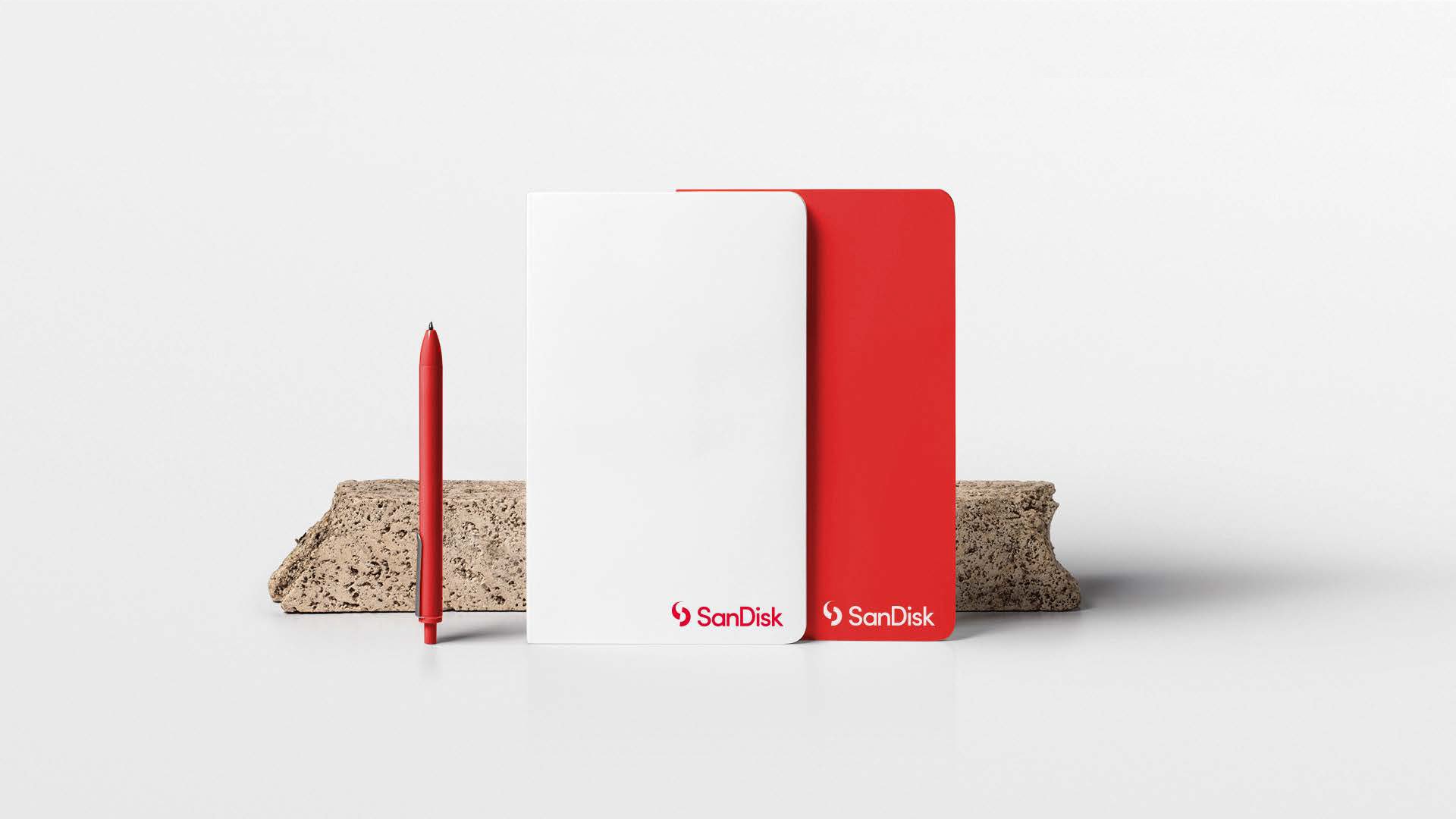
The globally dominant brand in photography and content storage was ready for an update. We executed a full transformation, from strategy to brand architecture, positioning it for continued leadership in a new era.
Credits:
Enri Moreno / Executive Creative Director
Brian Wood / Associate Creative Director
Jelita Aldrich / Designer
Project Details
-
SanDisk made a big decision to update its brand identity for the first time in its history, and they asked us to develop an identity system that would support the modern aesthetic.
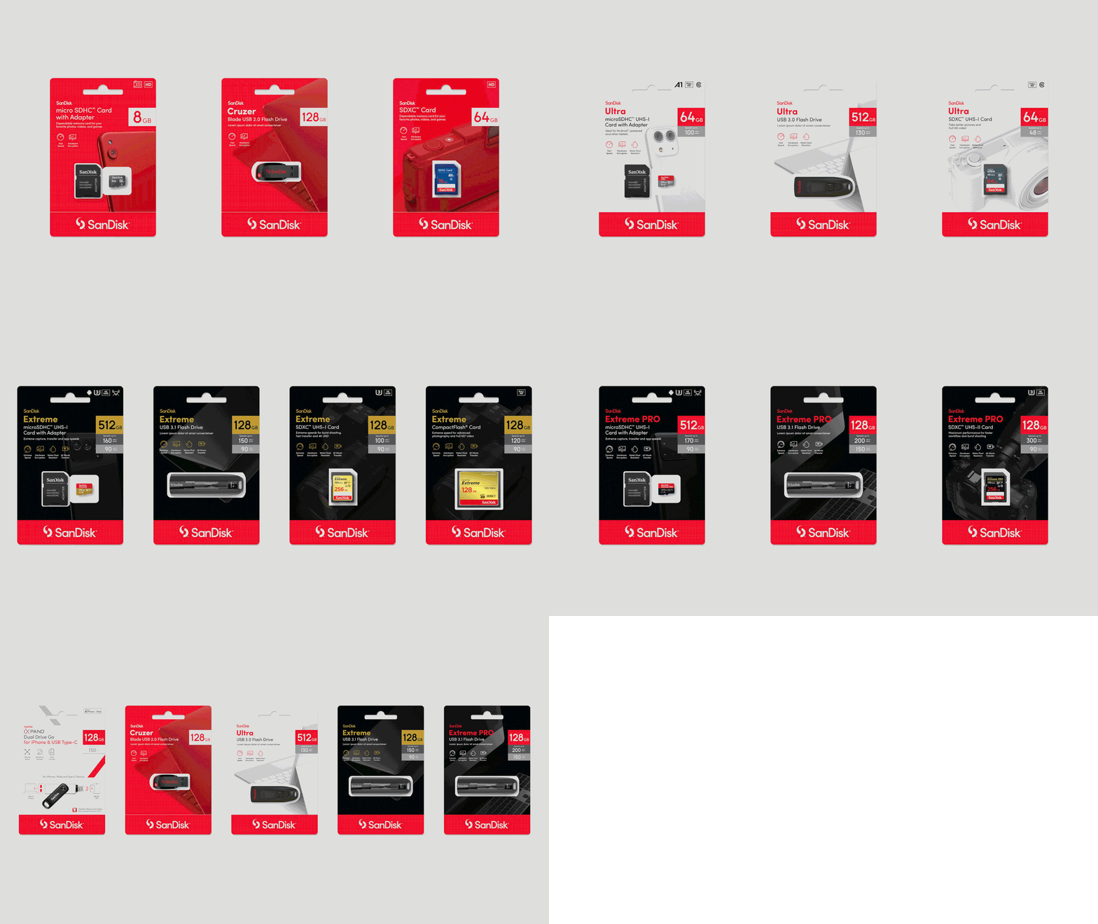
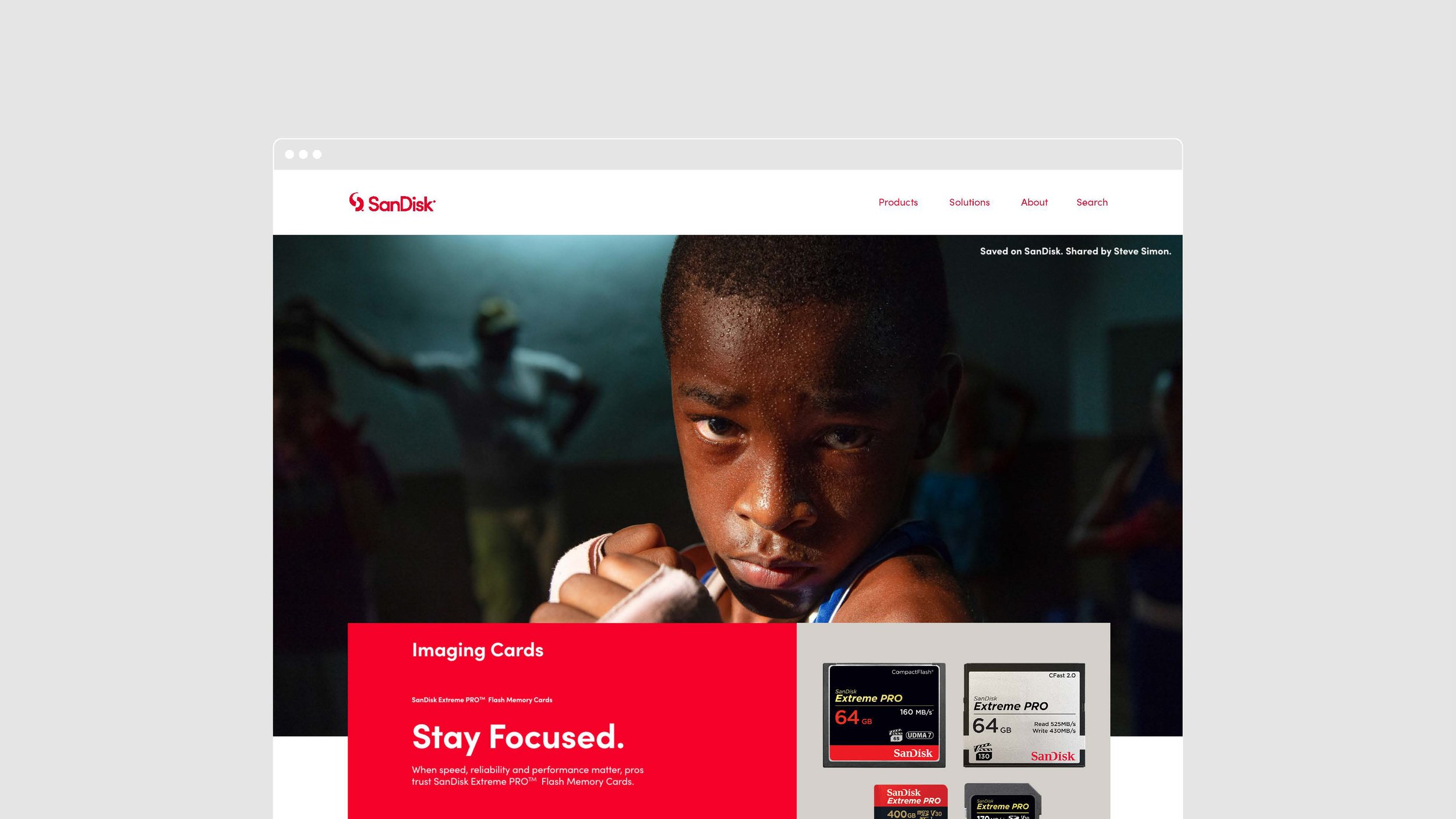
In parallel with this effort, SanDisk was about to roll out a new marketing strategy and tagline, which needed to be accounted for through visual direction, a collection of print and digital templates, a series of marketing material, and a design update of their global packaging. -
Developing an identity system without having developed the identity mark can pose challenges. The risk of interpretation or differing ideals can get in the way, so we established a series of workshops with stakeholders to understand the vision and strategy. Our goal was to comprehend the brand ethos to align explorations with expectations and aspirations.
-
A brand as big as SanDisk utilizes a multitude of assets given its array of consumer segments, global regions, and large teams. We divided the guidelines into chapters and focused on each one, at times in pairs, to meticulously construct a cohesive story that transcended identity, marketing, and packaging channels. This robust guidelines includes extensive usage guidance, a rich iconographic system, a marketing collateral system with templates, and a new packaging language featuring custom-created device models.


